The new issue of Wavelength is out now and as I posted about at the time, it’s the first issue since the successful crowd funding campaign finished.
I pledged my £20 and as my reward I not only got the warm feeling of contributing to keeping a piece of UK surf history in print but also one of my photo’s featured on the cover.
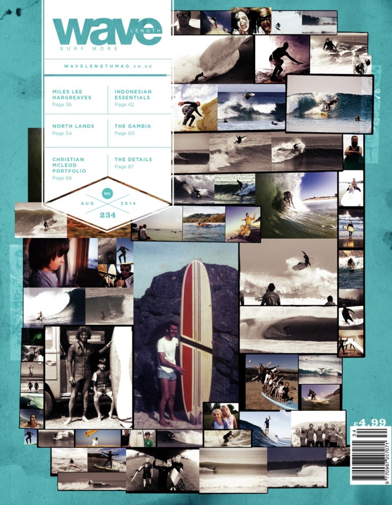
You might have to come a bit closer to the screen to see mine, it’s in the bottom right, touching the barcode, I am stoked it made it on there and I think the graphic designer did a good job to squeeze all those disparate images onto the one cover and still give it a relatively cohesive look, I really didn’t have any clue as to what it was going to look like until I saw it.
If you’re going to be in the same position I was in a few weeks ago and have your photo featured amongst others and you want some tips on how to make it appear more prominent here’s four ideas for you:
- Get your photo in early – I missed the first e-mail, I really should have been expecting it so there’s not much excuse, I submitted mine as soon as I got the second e-mail though so hopefully I didn’t hold up the process too much, needless to say, if you’re in early you’ve got more chance of becoming a more central part of the design.
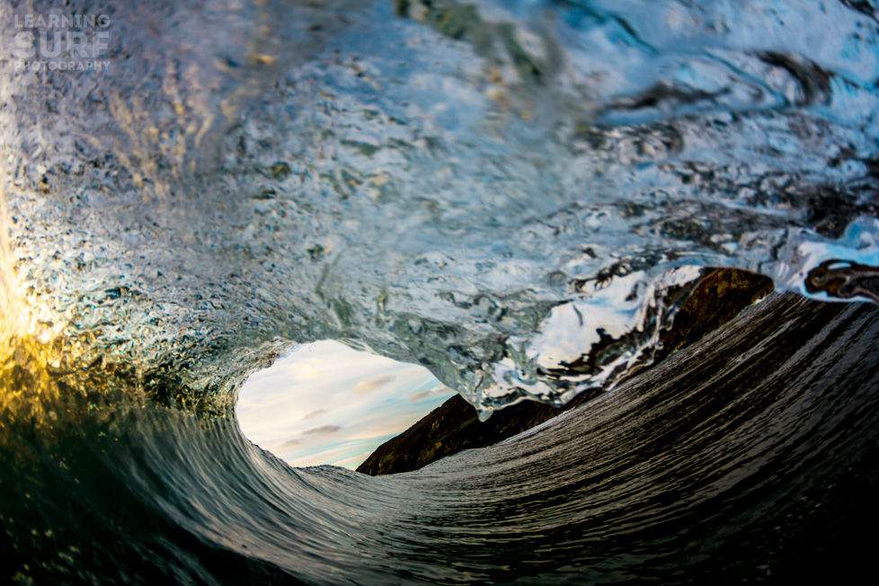
- Use a crisp photograph – the main part of the lip in mine was a little bit out of focus, I knew it was going to be part of a big collage of photo’s and it is genuinely one of my favourite empty wave shots, so I thought this is one of the only ways I’m going to see this in print as printing it at a more normal size would show the slightly off focus element more clearly, naturally this is not good news for the poor graphic design guy who’s got to deal with my slightly blurry photo.
- Have a surfer in the photo – I was very close to sending in a photo of my wife bodyboarding, but I thought it might be a bit controversial for a stand-up focused magazine, so in the end I went with an empty wave, having a person in the shot gives the designer something to work with, a reason to place it somewhere significant.
- If you can’t have someone recognisable in the shot, make it of a recognisable surf spot – the spot in my photo is not well known, it’s very fickle and never crowded, I doubt very much if it has ever or ever will again feature on or in a magazine, there’s nothing there to give the designer a reason to want to bring out the details.
And here’s my photo for you presented in glorious low res’, I love the colours and the shape of the wave and now it will be forever known as my first (kind of) cover shot:
You can get a copy of the magazine, or a subscription, here.
Do you have a photo that you would have liked to see on the sover? any more ideas for making it stand out? let me know in the comments.
Leave a Reply